The Historical Context of American Road Culture
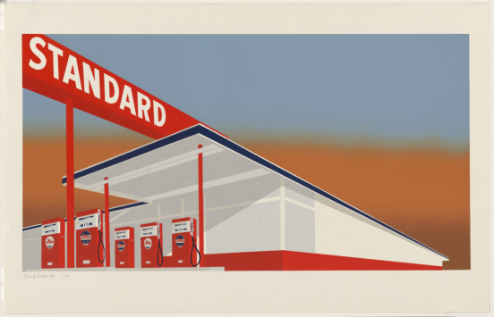
Edward Ruscha’s “Standard Station” is far more than a mere depiction of a gas station; it is a profound cultural artifact that captures the essence of 1960s American road culture. To understand the gravity of this masterpiece, one must look at the post-World War II economic boom, which transformed the automobile from a luxury into an essential component of the American Dream. The expansion of the interstate highway system, particularly the mythical Route 66, created a new visual landscape dominated by commercial signage, neon lights, and standardized roadside architecture.
Ruscha, having moved from Oklahoma to Los Angeles in 1956, frequently drove along Route 66. This repetitive journey exposed him to the rhythmic, almost hypnotic sequence of gas stations that punctuated the desolate Western landscape. These structures were not just utilitarian; they were beacons of modern consumerism and mobility. By elevating a mundane gas station to the scale and permanence of high art, Ruscha captured the shifting paradigm of the American West, where the romanticized frontier was replaced by the paved realities of petroleum and asphalt.
The Influence of Twentysix Gasoline Stations
The conceptual foundation for “Standard Station” was laid in Ruscha’s groundbreaking 1963 artist’s book, “Twentysix Gasoline Stations.” The book consisted of deadpan, unromanticized black-and-white photographs of gas stations along the highway. The Amarillo, Texas, Standard station was one of these photographs. By translating this specific, banal photograph into a massive, highly stylized painting in 1966, Ruscha successfully bridged the gap between conceptual photography and Pop Art painting.
Architectural Geometry and Cinematic Aesthetics
One of the most striking elements of “Standard Station” is its aggressive, sweeping geometry. Ruscha did not paint the station exactly as it appeared in reality; instead, he manipulated its proportions to create a heightened sense of drama and spatial tension. The painting employs extreme foreshortening, a technique where the object appears to recede rapidly into the distance. The station begins massively on the right side of the canvas and tapers sharply toward a vanishing point on the far left, creating a dynamic diagonal thrust that mimics the sensation of speeding past the structure on a highway.
The Power of Typography in Art
Ruscha originally trained as a commercial graphic artist, and this background is deeply embedded in the DNA of “Standard Station.” The word “STANDARD” is not merely a brand name in the painting; it acts as a crucial architectural and linguistic anchor. The crisp, sans-serif typography is painted with mechanical precision, removing the visible trace of the artist’s hand. This deliberate flatness forces the viewer to confront the word not just as text, but as a physical object and an aesthetic form, questioning the boundary between commercial advertising and fine art.
East Coast Pop Art vs. West Coast Pop Art
While Andy Warhol and Roy Lichtenstein were defining Pop Art in New York through the appropriation of comic books, soup cans, and celebrities, Edward Ruscha was pioneering a distinctly West Coast variation of the movement in Los Angeles. Understanding the differences between these two regional approaches is critical for appreciating Ruscha’s unique contribution to the art historical canon.
| Feature | East Coast Pop Art (e.g., Warhol) | West Coast Pop Art (e.g., Ruscha) |
|---|---|---|
| Subject Matter | Consumer goods, celebrities, mass media | Car culture, vast landscapes, architecture |
| Spatial Depth | Flat, claustrophobic, front-facing | Expansive, cinematic, deep vanishing points |
| Text Integration | Used as packaging labels or speech bubbles | Treated as monumental architectural elements |
| Underlying Tone | Ironic, cynical, hyper-commercialized | Cool, detached, observational, atmospheric |
Expert Advice: Analyzing Ruscha’s Print Variations
Beyond the original 1966 oil painting, Ruscha explored the “Standard Station” motif through numerous printmaking variations, particularly screenprinting. For art collectors, curators, and enthusiasts, understanding these technical variations is essential for grasping Ruscha’s obsession with multiplicity and seriality.
- Observe the Split-Fountain Technique: In prints like “Mocha Standard” (1969), Ruscha utilized a split-fountain screenprinting method. This involves blending two or more colors of ink on the same screen to create a seamless, gradient sky, mimicking the atmospheric smog and sunsets of Los Angeles.
- Look for Surreal Alterations: Pay attention to works like “Cheese Mold Standard with Olive” (1969). Ruscha often injected subtle, surrealist humor into his prints by adding incongruous organic objects into the rigid, geometric commercial landscapes.
- Analyze the Condition of the Margins: When evaluating Ruscha’s prints for collection, the pristine nature of the unprinted paper margins is critical. Because his work relies heavily on crisp, mechanical perfection, any smudging or foxing heavily impacts the piece’s aesthetic and monetary value.
Frequently Asked Questions (FAQ)
- What inspired Edward Ruscha to paint Standard Station?
- Ruscha was inspired by his frequent road trips between his hometown of Oklahoma City and his residence in Los Angeles along Route 66. The specific visual reference was a photograph he took of a Standard Oil gas station in Amarillo, Texas, which he first published in his 1963 book “Twentysix Gasoline Stations.”
- Where is the original Standard Station painting located today?
- The original 1966 oil painting, “Standard Station, Amarillo, Texas,” is part of the permanent collection at the Los Angeles County Museum of Art (LACMA), serving as a cornerstone of their contemporary art exhibitions.
- Why did Ruscha use such extreme angles in the painting?
- The extreme diagonal foreshortening was influenced by cinematic aspect ratios and the physical sensation of driving. By stretching the perspective, Ruscha created a sense of motion and monumentality, transforming a mundane roadside stop into a towering, almost heroic structure.
- What is the significance of the word “Standard” in the artwork?
- Beyond identifying the gas station brand (Standard Oil), the word “Standard” plays a dual role. It acts as a visual, geometric shape that anchors the composition, while also serving as a conceptual pun on the “standardization” of American culture, architecture, and consumerism during the mid-20th century.