Roy Lichtenstein stands as an undeniable titan of the Pop Art movement, a visionary artist who meticulously dissected and recontextualized the visual language of mass media and consumer culture. Emerging in the 1960s, Lichtenstein’s groundbreaking work challenged the prevailing dominance of Abstract Expressionism by embracing the mundane, the commercial, and the seemingly lowbrow. His iconic paintings, characterized by their bold outlines, vibrant primary colors, and signature Ben-Day dots, transformed comic book panels and advertisements into monumental works of art, forcing viewers to reconsider the boundaries between high art and everyday imagery. This pillar page delves into the profound impact of Lichtenstein’s most celebrated pieces, exploring the intricate techniques, philosophical underpinnings, and enduring legacy that define his monumental contribution to modern art.
The Revolutionary Impact of “Look Mickey”
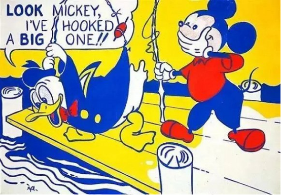
“Look Mickey,” painted in 1961, is widely regarded as one of Roy Lichtenstein’s seminal works, marking his definitive break from Abstract Expressionism and a bold foray into the burgeoning Pop Art aesthetic. This painting is not merely a depiction of a well-known cartoon but a foundational statement on art, originality, and the power of popular culture. Its creation story, often recounted as a challenge from his son who dared him to paint something as good as a comic book, underscores Lichtenstein’s deliberate pivot towards accessible, mass-produced imagery as a source for serious artistic inquiry.
Origins and Context: Transitioning from Abstract Expressionism
Before “Look Mickey,” Lichtenstein’s artistic journey included phases of Cubism and Abstract Expressionism, reflecting the dominant styles of his era. However, he felt an increasing disconnect with the introspection and emotional intensity of Abstract Expressionism, seeking a more objective and detached approach to art-making. The early 1960s were a fertile ground for artists questioning traditional notions of art, spurred by consumerism and the pervasive influence of media. Lichtenstein found his voice by turning to what was considered “low art”—comic strips, advertisements, and commercial illustrations—and elevating them with the meticulous techniques of fine art.
- Early Influences: Lichtenstein experimented with incorporating cartoon characters like Mickey Mouse and Donald Duck into his abstract works as early as 1958, hinting at his future direction.
- The “Challenge”: The anecdotal story of his son asking, “I bet you can’t paint as good as that, eh, Dad?” while looking at a Mickey Mouse comic book, perfectly encapsulates the shift in artistic focus Lichtenstein was about to undertake.
- Rejection of Abstract Expressionism: Lichtenstein sought a cooler, more intellectual approach, moving away from the gestural and subjective. He saw commercial art as possessing a clarity and directness that he wished to explore.
Reinterpreting Cartoon IPs: Mickey Mouse and Donald Duck as Art Subjects
By choosing “Look Mickey,” Lichtenstein deliberately selected an image that was instantly recognizable and deeply embedded in the collective consciousness. Mickey Mouse and Donald Duck, as creations of Disney, represented the epitome of American popular culture, innocence, and mass-market entertainment. Lichtenstein’s reinterpretation was not an act of simple reproduction but a complex process of transformation, isolating the image, altering its scale, and rendering it with a painterly precision that belied its commercial origins.
- Iconic Status: Mickey Mouse, a global phenomenon, served as a perfect vehicle for Lichtenstein’s exploration of ubiquitous imagery. The humor and familiarity of the characters allowed for an immediate connection with the viewer.
- Artistic Intervention: Lichtenstein meticulously cropped the original comic book panel, focusing on the expressions and interaction between Mickey and Donald. He simplified the color palette, intensified the outlines, and introduced his signature Ben-Day dots to mimic the mechanical printing process, yet on a grand scale.
- Questioning Originality: By painting a copyrighted cartoon character, Lichtenstein subtly questioned the very notion of artistic originality and authorship, a central theme in Pop Art. He transformed a mass-produced image into a unique, handmade artwork.
Technique and Message: Blurring High Art and Low Culture
The technical execution of “Look Mickey” is crucial to its revolutionary message. Lichtenstein’s use of Ben-Day dots, a printing technique used in comic books and newspapers to create shading and color, became his artistic hallmark. Applied with stencils and often in primary colors, these dots, when viewed from a distance, blend to form a cohesive image, but up close, they reveal their mechanical, impersonal nature. This technique was a deliberate comment on the industrial process of image making and its omnipresence in modern life.
- Ben-Day Dots: The meticulously hand-painted dots mimic the halftone printing process, highlighting the artificiality and mass-produced quality of the original source. This technique became synonymous with his style.
- Bold Outlines and Primary Colors: Lichtenstein emphasized the stark black outlines and limited, unmodulated primary colors (red, yellow, blue) characteristic of comic books, further enhancing the graphic, commercial aesthetic.
- Dialectic of Reproduction: “Look Mickey” forces a dialogue between the art object and its source. It is both a painting and a comic strip, simultaneously celebrating and critiquing the visual culture it draws from. It asks whether art should always be “original” or if reinterpretation can be a profound artistic act.

Deconstructing “Whaam!”: War, Comics, and Art
“Whaam!,” created in 1963, is arguably Roy Lichtenstein’s most famous work and a quintessential example of Pop Art’s engagement with contemporary culture, particularly the themes of war and media representation. This monumental diptych, inspired by a panel from an All-American Men of War comic book published by DC Comics in 1962, captures a dramatic moment of aerial combat. Its striking visual impact and complex interplay of art, war, and popular media make it a enduring subject of analysis and appreciation.
The Comic Book Aesthetic: From Panel to Canvas
Lichtenstein meticulously translated the raw energy of a comic book panel into a large-scale painting, exaggerating its stylistic elements. The original source depicted a fighter jet firing a missile at an enemy plane, resulting in a fiery explosion. Lichtenstein’s genius lay in his ability to isolate this fleeting moment and imbue it with a new sense of permanence and artistic gravity. He didn’t just copy; he transformed, edited, and amplified.
- Source Material: The specific panel was from “Star Jockey” in All-American Men of War #89. Lichtenstein often selected panels that were visually dynamic and emotionally charged, even if the emotion was presented in a highly stylized manner.
- Two-Panel Format: The diptych format (two separate canvases presented together) mimics the sequential nature of comic strips, enhancing the narrative flow and the dramatic build-up to the explosion. The left panel shows the attacking plane, the right shows the explosion and the word “WHAAM!”.
- Exaggerated Style: Lichtenstein enlarged the image significantly, which magnified the Ben-Day dots and bold lines, making the artificiality of the comic book printing process overtly visible and a central part of the artwork’s identity.
Narrative and Symbolism: War, Masculinity, and Detached Violence
“Whaam!” is more than just a depiction of a battle; it’s a commentary on how war is portrayed and consumed through popular media. The painting’s detached, almost celebratory presentation of violence, coupled with the dramatic onomatopoeia, raises questions about the desensitization to conflict and the romanticization of warfare in comic books and other media.
- Onomatopoeia: The massive, stylized “WHAAM!” dominates the right panel, serving as both a sound effect and a powerful graphic element. It emphasizes the explosive climax while simultaneously drawing attention to the artificiality of the sound’s representation.
- Heroism and Masculinity: The pilot’s laconic dialogue, “I pressed the fire control… and ahead of me rockets flared,” embodies a stoic, almost robotic masculinity often celebrated in war comics. Lichtenstein presents this without explicit judgment, allowing the viewer to interpret the irony.
- Detached Violence: Despite the violent subject matter, the painting feels strangely impersonal. The stylized nature, flat colors, and mechanical dots create a distance, preventing the viewer from experiencing the visceral horror of war directly, thus mirroring how media often sanitizes violence.
Cultural Resonance: Anti-War Statement or Celebration of Pop?
The interpretation of “Whaam!” has been a subject of extensive debate. Is it an anti-war statement, a critique of militarism, or simply an aesthetic exploration of a prevalent cultural motif? Lichtenstein himself maintained a degree of artistic neutrality, allowing the work to speak for itself, but its emergence during the Vietnam War era inevitably lent it a layer of social commentary.
- Vietnam War Context: Created during a period of escalating U.S. involvement in Vietnam, “Whaam!” resonated deeply with contemporary anxieties and discussions surrounding war and its media portrayal. Many saw it as a subtle critique of military glorification.
- Pop Art Icon: Beyond its potential political readings, “Whaam!” cemented Lichtenstein’s status as a Pop Art icon. It perfectly encapsulates the movement’s fascination with mass culture, its blurring of high and low art, and its use of irony and appropriation.
- Legacy and Influence: The painting remains one of the most recognized artworks of the 20th century, influencing subsequent generations of artists and continuing to provoke thought on the relationship between art, media, and conflict. It exemplifies how everyday imagery can be transformed into profound artistic statements.

Emotional Depth in “Crying Girl” and “Hopeless”
While Roy Lichtenstein is often associated with the detached, cool aesthetic of Pop Art, many of his works, particularly those featuring women, delve into intense emotional states. His “Crying Girl” series (including versions from 1963 and 1964) and “Hopeless” (1963) are prime examples. These paintings appropriate images from romance comic books, transforming melodramatic narratives into monumental, yet ironically detached, expressions of despair and vulnerability. Lichtenstein’s meticulous rendering of these highly emotional scenes forces a confrontation with the stylized portrayal of feelings in popular media.
The Archetypal Weeping Woman: Romance Comics as Source
Lichtenstein’s weeping women draw heavily from the visual tropes of 1950s and 60s romance comics, a genre often characterized by exaggerated emotional narratives, dramatic close-ups, and predictable storylines of heartbreak and longing. He selected panels where women are shown in moments of intense distress, tears streaming, faces contorted in sorrow. These images, once fleeting and disposable in their original context, gain a new weight and presence on Lichtenstein’s canvases.
- Common Trope: The “damsel in distress” or the “heartbroken lover” was a recurring motif in romance comics, reflecting societal expectations and gender roles of the era. Lichtenstein isolated and magnified these archetypes.
- “Crying Girl” Series: The various “Crying Girl” paintings depict women with perfect, stylized tears, often with a hand near the face, emphasizing their emotional fragility. The tears themselves become graphic elements, rendered with the same precision as the Ben-Day dots.
- “Hopeless”: This painting features a woman submerged in water, her face filled with despair, accompanied by a speech bubble that reads, “I DON’T CARE! I’D RATHER SINK — THAN CALL BRAD FOR HELP!” This text amplifies the melodrama and the woman’s perceived helplessness.
Beneath the Ben-Day Dots: Amplifying and Distancing Emotion
The paradox of Lichtenstein’s crying women lies in his technique. By applying his signature Ben-Day dots, bold outlines, and flat colors to highly emotional subjects, he simultaneously amplifies the drama and creates an emotional distance. The very artifice of the comic book style, when monumentalized, prevents a truly empathetic connection, instead prompting an intellectual examination of the portrayal of emotion.
- Exaggerated Emotions: The expressions are not subtle; they are theatrical and over-the-top, mirroring the dramatic conventions of comic books. This exaggeration, when blown up, becomes almost absurd, highlighting the constructed nature of the emotion.
- Stylized Tears: The tears are not realistic; they are perfectly formed drops, often glistening with a single highlight, becoming graphic symbols of sadness rather than genuine physiological responses. This stylization underscores the media’s way of packaging emotion.
- Irony and Detachment: Lichtenstein’s cool, mechanical rendering of such raw emotion introduces a layer of irony. The viewer is invited to appreciate the aesthetic qualities of the artwork while simultaneously reflecting on the superficiality or manipulation inherent in media’s portrayal of human feeling.
Feminist Interpretations: Critique or Perpetuation of Stereotypes?
Lichtenstein’s portrayal of women, particularly in his romance comic-inspired works, has been a significant point of discussion, especially within feminist art criticism. Some view these works as a critique of the stereotypical and often passive roles assigned to women in popular culture, while others argue they inadvertently perpetuate these very stereotypes.
- Critique of Stereotypes: One interpretation suggests that Lichtenstein, by isolating and monumentalizing these images, exposes the limited and often demeaning portrayals of women in mass media. He holds a mirror up to society’s consumption of these archetypes.
- Perpetuation of Stereotypes: Conversely, some critics argue that by merely reproducing these images, even with artistic intervention, Lichtenstein did little to challenge the underlying sexism, and instead, inadvertently reinforced the image of women as emotional, dependent, and passive figures.
- Ambiguity: Lichtenstein himself rarely offered explicit political or social commentary on his works. This ambiguity allows for multiple interpretations, making the “Crying Girl” and “Hopeless” paintings enduring subjects for discussions on gender, media, and art’s role in reflecting or shaping cultural narratives.

“Landscape No. 1”: Lichtenstein’s Experimental Landscapes
While Roy Lichtenstein is predominantly celebrated for his comic strip and advertising appropriations, his artistic explorations extended beyond these iconic subjects. Towards the mid-1960s, Lichtenstein embarked on a series of landscape paintings, a move that might seem surprising given his focus on urban and commercial imagery. “Landscape No. 1” (1964) exemplifies this experimental phase, where he applied his distinctive Pop Art methodology to a traditional genre, challenging perceptions of both landscape painting and his own artistic range.
Beyond the Human Figure: New Subject Matter
After establishing his reputation with images of comic book heroes, crying women, and consumer products, Lichtenstein sought new avenues for his artistic inquiry. The landscape offered a fresh subject through which he could continue to explore themes of perception, representation, and the relationship between art and its reproduction. This shift demonstrated his consistent interest in how images are constructed and consumed, regardless of their original source.
- Diversification of Themes: Moving into landscapes allowed Lichtenstein to prove that his technique and conceptual approach were not limited to specific types of imagery but could be universally applied to any visual data.
- Challenging Expectations: By tackling a genre steeped in art historical tradition (from Romanticism to Impressionism), Lichtenstein deliberately juxtaposed his modern, mechanical aesthetic with a subject often associated with natural beauty and painterly expression.
- Focus on Visual Data: For Lichtenstein, the landscape became another form of “found image” or visual information, which he could process and re-present through his Pop Art lens, much like a comic strip panel or an advertisement.
Pointillism and Pop Narrative Fusion: A Mechanical Rendition of Nature
In his landscapes, Lichtenstein ingeniously fused the optical effects of Neo-Impressionist Pointillism with his Pop Art sensibility. Artists like Georges Seurat used tiny dots of pure color to create shimmering, blended images when viewed from a distance, aiming for a scientific approach to color and light. Lichtenstein adopted this dot matrix, but instead of using it for naturalistic light, he employed his signature Ben-Day dots to mimic mechanical reproduction, creating a stylized, almost artificial version of nature.
- Reinterpreting Pointillism: Lichtenstein’s dots are not the delicate, varied brushstrokes of Seurat; they are uniform, machine-like Ben-Day dots, often in bold, unmodulated colors. This transforms the organic feel of traditional pointillism into a commercial, graphic effect.
- Simulated Light and Texture: He used the dots, along with areas of solid color and bold lines, to simulate natural phenomena like sunlight, water reflections, and sky, but always with a sense of deliberate artifice. The effect is often more abstract than representational.
- Pop Narrative: While lacking explicit comic book narratives, these landscapes tell a story of modern perception. They suggest that even our experience of nature is mediated through images, photographs, and printed reproductions, rather than purely direct observation.
Challenging Traditional Genres: A New Perspective on Landscape Art
Lichtenstein’s landscape series, including “Landscape No. 1,” challenged the very essence of traditional landscape painting. Historically, landscapes aimed to capture the sublime, the picturesque, or the emotional connection to nature. Lichtenstein’s approach, however, was cool, analytical, and focused on the mechanics of visual representation, stripping away sentimentality and emphasizing the constructed nature of the image.
- De-Romanticizing Nature: By rendering landscapes with the same impersonal, commercial aesthetic he applied to comic book panels, Lichtenstein effectively de-romanticized nature, presenting it as another subject for graphic design and mechanical reproduction.
- Critique of Representation: These works implicitly question how we “see” and interpret landscapes in the modern age. Are we seeing nature itself, or are we seeing a representation of nature filtered through photography, advertising, and other media?
- Expansion of Pop Art’s Scope: The landscape series demonstrated the versatility of Pop Art as a movement. It wasn’t just about consumer goods or comic strips; it was a method of seeing and re-creating the world through the lens of mass media aesthetics, applicable to any visual subject matter.

Lichtenstein’s Signature Techniques and Artistic Philosophy
Roy Lichtenstein’s distinctive visual language is immediately recognizable, characterized by a set of technical and philosophical principles that defined his approach to art. His meticulous adoption of commercial printing aesthetics, particularly the Ben-Day dot system, alongside his strategic use of appropriation and irony, formed the cornerstone of his artistic philosophy. These elements collectively allowed him to bridge the gap between high art and popular culture, fundamentally altering perceptions of originality, authenticity, and the very purpose of art in a consumer-driven society.
Ben-Day Dots and Commercial Printing: The Essence of His Style
The most iconic feature of Lichtenstein’s work is his use of Ben-Day dots. Named after printer Benjamin Henry Day Jr., this technique involves small, colored dots (typically red, yellow, blue, and black) that, when spaced and sized appropriately, create the illusion of other colors or shades when viewed from a distance. Lichtenstein painstakingly hand-painted these dots, often using stencils, to mimic the mechanical processes of commercial printing, such as those found in comic books and newspapers.
- Simulating Mass Production: By enlarging and meticulously rendering these dots on canvas, Lichtenstein highlighted the artificiality and mechanical nature of image reproduction. He brought the often-overlooked mechanics of print media to the forefront of fine art.
Literary and art analysis note: This article is independent literary, science-fiction, art-history, or cultural commentary. It is not official publisher, author, estate, museum, gallery, school, award, franchise, brand, or rights-holder material, and it does not provide legal, academic, collecting, conservation, health, safety, or professional advice.Independent commentary note: Names of authors, books, artworks, characters, artists, publishers, franchises, awards, museums, films, platforms, and rights holders are used only for identification and commentary. This site is not affiliated with, sponsored by, authorized by, or endorsed by those parties, and does not claim official status, licensing, ownership, or definitive interpretation.Art history note: Art conservation, sculpture technique, collecting, museum, catalogue, public art, and appraisal-related topics are educational commentary. They are not restoration instructions, professional conservation treatment, authentication, valuation, legal advice, collecting advice, or safety training.